Thursday, December 19, 2013

Tea Time with Tracey


Today's post is dedicated to Tracey Fletcher King, a wonderful artist and storyteller who shares ups and downs of everyday life in beautiful color at her blog. I first learned about Tracey through Paint Party Friday and look forward to her lovely artwork and laugh-out-loud humor every time I visit her blog. In fact, I secretly wish that not only could I paint as well as her, but that I could also be even half as funny, (OK, even a quarter as funny would be nice).

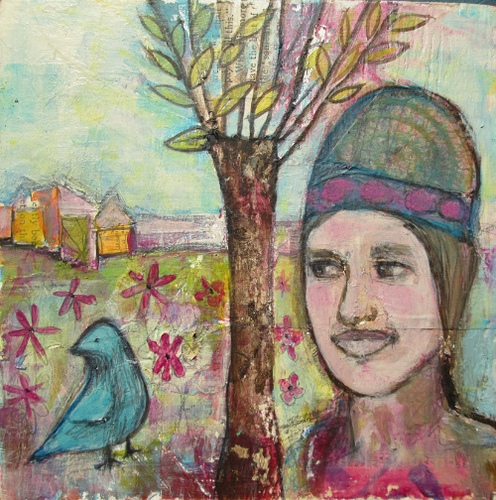
Sadly, this year has been a challenging one for Tracey, as she is battling cancer. So today the Paint Party Friday community is having a virtual tea party in her honor. My contribution is a still life painting in acrylic that I started while taking Table Top Drawing and Painting with Diane Culhane and finished(?) earlier this week. I decided it would fit the tea party theme nicely and hopefully add a bit of cheer to the party! Something about painting in acrylic sets my inner critic in high gear, but I am determined to get better at it. I find that using color is not always so easy, nor is striking a balance between realism and whimsy as I was aiming for here.

Thank you for being such a wonderful inspiration to us all, Tracey! I hope that you enjoy the holiday season with your family, and that this coming year is full of renewed health and energy for you.

Thank you also to Kristin and Eva for continuing to host Paint Party Friday and provide the opportunity to share our art with such an amazingly supportive and inspiring group of artists.


Thursday, November 21, 2013

A week of table top drawing and painting


Three Vases
colored pencil drawing on black paper

Do you ever set limits for yourself that you later realize are somewhat arbitrary and perhaps more than a little silly? I seem to be good at that one. Case in point -- for a long time, I've had the idea that I am not interested in still life drawing and painting. Maybe it's because I had to do so many still life drawings of boring subjects (cones, balls, cubes) in drawing classes long ago. Anyway, because I enjoyed Diane Culhane's Between Speech and Silence Class last summer, I couldn't resist signing up for her latest class, "Table Top Drawing and Painting."


We've been drawing what's on our dinner table in our sketch books, gathering up fun items to draw from around our homes and in general having a fantastic time with what I used to think was boring. I'm seeing more things around me every day to draw and paint.


This painting, done in acrylic on gessoed watercolor paper is giving me hope that I am making progress with acrylics. Diane is teaching us to glaze, using gel medium, leading to some beautiful transparency and luminosity.

I'll be sad for this class to come to an end, but thrilled with the new inspiration it's given me to have fun with drawing and painting the things around me in my everyday life.

Thanks for stopping by! I always appreciate your comments.


Saturday, November 9, 2013

To Sell or Not to Sell?

I'll admit it - I'm a little afraid to try selling my art. I go back and forth about it, toying with the idea, dabbling in it a bit, but not wholeheartedly trying to sell. The business side of it terrifies me -- I'm just not that interested in numbers -- surprise, surprise -- as I'm sure many artists feel. I have sold a few pieces here and there, more by accident than by clear intention on my part. It's scary to put yourself out there! So today, I've taken one small step in that direction. I've listed some of my work at Society6. I'll be updating my profile there and hopefully adding more work soon. It's a cool site, very easy to use.

I'd like to sell originals of my work, but that also terrifies me. There is so much to learn about the matting and framing side of it, not to mention figuring out where to sell and how to price my work. I guess I am easily overwhelmed. And, like most artists, I'd much rather be happily creating and not bothering my mind with the pesky details of business.

Do you sell your work? How did you get started? What has been the best part of this process for you? Any advice to the inexperienced seller?


Thursday, November 7, 2013

Night and Day: Mixed Media Altered Book Pages


It's been a blustery, stormy week in my neck of the woods. I'm busy with work now, and summer seems like a distant memory. I'm thinking back longingly tonight as I look at the paintings I did in Diane Culhane's excellent Between Speech and Silence Class. We were supposed to be painting on wood panels for this exercise, but decided that an altered book I'd started way back when would be fun to use for a side-by-side spread, one cool and one warm.


I found some wonderful patterns browsing through an old Real Simple magazine that became fabulous leaves for my trees. Then came adding the figures to suggest dialog, in this case a bird and woman resting by a tree. I don't usually consider myself a storyteller with my art, so this was a new direction for me. I love creating the suggestion of a story for the viewer to complete with their imagination.


Did I mention how much fun I had doing these paintings? Looking at them now makes me want to drop everything and get my paints out. The weekend is almost here!

I'm linking this with Paint Party Friday. Thanks so much for visiting my blog. I always enjoy your comments.

Monday, October 28, 2013

Take back your heart - Art Journal Page

This is a page in journal made from a mail art catalog I'd started over a year ago but hadn't finished. After seeing some of the lovely work in Suzi's October Art Journal Journey, I was inspired to join in. The theme is 'she art', which I had to research a bit --  'not sure if I got it right or not, but it was fun anyway -- along with the concept of feminine.


There are many directions to go with this theme. This lovely woman was already on the page and is very feminine to me, along with some flowers, because what could be more feminine than flowers? I started looking through a magazine for words and further inspiration, which lead to the discovery of this image of the earth in hand that I decided would look nice with the overall color scheme.


From there, came the challenge of tying everything together with the theme which somehow brought to mind these words from William Wordsworth: 

The world is too much with us; late and soon,
Getting and spending, we lay waste our powers;—
Little we see in Nature that is ours;
We have given our hearts away,"


Using poetry in my art always makes me happy. Wordsworth wrote this poem in the 1800's and yet his words are perhaps even more relevant for us today than they were during his lifetime. The idea of reclaiming our hearts through a connection with nature seems very beautiful, peaceful and feminine to me. 

Thanks much to Suzi for hosting this challenge, and thank you for visiting my blog. I always love seeing the other beautiful artwork out there, and for your comments.

Friday, October 25, 2013

Cityscape, Wabi-Sabi Style

Partial Clearing
mixed media on 8" x 8" canvas

In the wabi-sabi style, textures are rough, colors are subdued and mystery is admired. That's what I had in mind while working on this painting. For texture, I pressed wire mesh into modeling paste. I hadn't used modeling paste previously and was surprised at how long it takes to dry! But the texture is great. I also have some wonderful, gauzy paper that looks so beautiful in collage. I'm not sure if I'm finished yet with this one or not -- I'd like to build up the layers of paint toward the top, but I don't want to over do it, or ruin what I already am liking about this piece.  

Thanks so much for stopping by -- I always appreciate your comments!

Wednesday, October 9, 2013

The Evolution of a Gel Print

This story begins here, with a few solid colors printed on a piece of watercolor paper.


There were so many things I liked about this original print. The colors are soothing and the overall composition is quite nice. I could have stopped here and been happy. In fact, it may be fair to say I should have stopped here, or at least been a bit more cautious as I proceeded. But as you can see, I forged madly ahead with handmade stencils and more passes on the plate until I ended up here:


Yikes! This definitely falls into the it-seemed-like-a-good-idea-at-the-time category. Even so, I really love how the bottom half came out. As I looked more at this print, I decided it had a split personality and I wasn't sure what to do to make everything work together. So, I cropped my favorite parts, ending up with three smaller pieces.


The beauty of printing on watercolor paper, is that it's sturdy enough for collage. I ended up doing a lot of collage on this part of the print.


There was a lot I liked in this section, but I wasn't so happy with the red and gold, so again collage came to the rescue!


And finally, my favorite part of the original print:


For a very process-oriented artist, as I tend to be, this is such a satisfying and enjoyable way to work. 


I'm linking this to Carolyn Dube's Colorful Gelli Print Party and to Paint Party Friday. Check them both out to see all of the wonderfully creative things people are doing with paint! Thank you so much for visiting my blog!  I always appreciate your comments.


Tuesday, October 8, 2013

Gelli Plate Monoprint


It's hard to imagine anything much more relaxing and fun than playing with the gelli plate. I've had mine over a year and so far I've used it primarily to make collage papers. But after taking Carla Sonheim's Gelli Plate Printmaking Introductory online class, I've learned some new techniques to use with the plate to make monoprints that are beautiful pieces of art in their own right. This print is on watercolor paper, made with simple handmade stencils. 

Saturday, September 28, 2013

Face #20: Resist


Have you tried using a resist yet? Ayala asked this in a post on Facebook today, which reminded me that I hadn't tried using a resist. So thanks to Ayala for suggesting this. I love using crayon resists with watercolor. It's like magic when you paint over the crayon and the lines appear. I did use a reference for this face, which I am finding very helpful, even if I am not striving for realism or an exact likeness. As I worked on this face, I added shading and details with pencil and marker. The leaf shapes were an unexpected bonus in her hair that I couldn't, um, resist.  

Friday, September 27, 2013

Face #19: Pretty in Pastel?


I'll be honest -- this is not my favorite face that I've done this month, but here she is, #19. I used pastels, which I don't normally use to try something different. I was trying to do an abstract face and ended up with this sort of stylized face instead. I wouldn't mind it being a stylized face if that is what I was trying to do. Even so, I'm glad I experimented with something new. There is always value in the process, no matter how the product ends up. I actually cut her face out because I didn't like the right side at all. Then I put her on one of my new place mats to take her picture because it seemed to go nicely with the rest of the composition.

Thursday, September 26, 2013

Face #18: Doe-eyed Abstract


Another attempt at an abstract face -- this one is a mixed media sketch in my sketchbook, beginning with ball point pen, then adding a bit of pencil, charcoal, and colored pencil. I kinda like her!

Ipad Portraits


Faces 15, 16, and 17 are sketches I did on my Ipad using the app, Paper by 53. I use stylus, but it's also possible to sketch just using your finger on the screen. It's a fun way to get some sketching in, especially if you're on the go and don't want to carry your art supplies with you.

Wednesday, September 25, 2013

Face #14: Abstract Portrait


 Realistic faces are not easy to do well, nor are abstract faces for that matter! I really want to be able to do abstract faces. I'm not sure why. It's just what I want to do. So here is an attempt at an abstract face. I used a thick sharpie to outline shapes and then began painting, first with watercolor, then before I knew it, the acrylics were out again. I was keeping in mind the concept of suggesting dialog by having two figures in the painting as I learned in Diane Culhane's excellent between speech and silence class, hence the bird. I added a bit of collage again at the end, because I love collage, especially bits of text like this. I love languages, reading, poetry, and words, so I enjoy having bits of text in my pieces that give some interesting visual texture and hopefully create a bit of mystery as well.

Face #13 - Mixed Media Portrait


This is turning out to be one of those paintings that looks better on the screen than in real life, maybe due the reduced size. I focused on creating a multi-layered background before adding the face, still continuing to learn how to paint with acrylics and not go completely mad in the process. I think I'm getting the hang of it. Each time it's a little easier and more natural, and yes, fun!

Face #12 -- a pencil sketch


This is a pencil study, done in my sketchbook tonight after I decided that I need to do more serious practice of faces. I've been leaning toward abstraction and whimsy in my artwork recently, but I think that studying a face this way in pencil can help me draw abstract faces more convincingly as well. And I'm pretty happy with this face. I worked really hard to get the shape of the face right, and to get some shading that helped to add some dimension.

Tuesday, September 24, 2013

White-faced woman -- mixed media portrait


I've been participating in Ayala Art's 29 Faces Challenge this month. At this point, I am quite sure I will not make it to 29 faces this month. This is face #11. I drew and painted, drew and painted, ending up with a rather crazy, or shall we say expressionist palette. I am still finding my way with acrylics, alternately loving then hating them, but hopefully getting better as I practice more. Today's painting session was very enjoyable. I opened up my container of little collage scraps and found some fun pieces to add for some additional interest and fun.

Thanks so much for visiting my blog! 


Saturday, September 21, 2013

Face #10: Mixed Media Portrait


This is a mixed media portrait on a wood panel that I started recently. I'm experimenting with drawing and acrylic together in this piece. So far, I'm happy with the lines, collage, and colors, but less happy with her face. The nose is better than some I've done, but her eyes aren't matching so I want to go back in and work on them some more. 

Monday, September 16, 2013

Sketching Fun


This sketch for Face #9 almost counts as two faces, doesn't it? I was playing around in my sketchbook with line at first, then adding facial features at different angles along with a bit of shading. I might go back in and work on creating layers...or not. It is just a sketch, after all. But spending time practicing sketching individual features looks like something I should do more often.

Thanks so much for stopping by!

Gel plate + Gel pen = Face #8


This is my face #8 for the 29 Faces Challenge and I have to say that I really like it! I did this one last summer on an index card. I was playing around with my gel plate, paint and a spray bottle. The textures turned out great. After it dried, I saw a face, just waiting for a few simple lines to bring it to life. My white gel pen turned out to be just right over the darker background. 

Thanks so much for stopping by!


Twilight Smile -- mixed media portrait

Twilight Smile
mixed media on paper
9" x 12"


This is one of the faces I painted for the 29 faces challenge (Face 7).  My obsession in this painting was creating layers - layers of stenciling, collage, stamping, washes until I was ready to draw a face. I did use a reference as I drew this woman, but I didn't worry too much about getting an exact likeness. I've doodled faces for most of my life, but I find that sometimes looking at real faces when I draw really helps me with getting the details and expression right. This woman's crooked half smile really appealed to me!

I'm also sharing this with Paint Party Friday.  Check it out to see some wonderful art and join in the fun. Thanks so much for visiting!!!


Sunday, September 15, 2013

29 Faces 2013 -- 4, 5, 6


I'm playing catch-up in the 29 Faces Challenge again with some faces I did earlier in the year, January to be exact. These two faces all started with a journal I decided to make for myself at the beginning of the year, following a quest theme.


Since quests were big in medieval times, I found this lovely portrait of Eleonora of Toledo done by the artist Italian artist Agnolo di Cosimo in 1545 for the cover. I kept looking at her face and decided to sketch using Carla Sonheim's version of a Klee Transfer painting. In this method, you put a piece of carbon paper down on your paper, and draw blindly. The goal isn't a realistic drawing, but hopefully an interesting drawing. After doing the first carbon drawing, I added some color. 


She certainly looks much different than the original! I like parts of this drawing, but I hate that her nose is so long and her chin so small. Still, it was fun to play. After this one, I decided to try another one on a prepared background in my journal. Here is what the blind carbon sketch looks like before painting.


It's actually quite interesting how similar this drawing is to my first one, and how they both are so different from the original reference. But I like the proportions better in this one. Noses are just so hard, but I will keep trying!

After this step, I added some paint and pencil.


And here she is, Eleonora for the new millennium -- older and wiser, still pensive and serious, with perhaps a bit of attitude.

Thanks for visiting!

29 Faces 2013 - 1,2,3

It's halfway through September, and I've decided to join in Ayala Art's 29 Faces challenge. I participated in this challenge last year, and really enjoyed it! Since I'm waaaaaaay behind, I'm cheating a bit by posting some faces here that I actually did last summer. These are small semi-abstract mixed media doodles done in ink and acrylic.


Thanks for stopping by! 


Saturday, September 14, 2013

"In the Distance" a Wabi-Sabi Landscape

In the Distance
acrylic on 8" x 10" canvas

In 2011, I had the good fortune to take a workshop with Serena Barton in Portland which focused on her interpretation of the wabi-sabi concept in encaustic. I blogged about my experience that day in an earlier post. At the time, I was completely enthralled by the wax, and yet as time has passed, I find myself thinking about wabi-sabi again and again. I even have a journal I started after that workshop that I use specifically for contemplating wabi-sabi.

According to Serena, "Wabi-Sabi is an aesthetic, a state of mind, a mix of emotions, and a way of perceiving life. It embraces cycles of change, including life and death. Wabi-Sabi values the seasoned, well-worn, accidental, and imperfect. It includes the sorrow of change and loss, as well as the acceptance of these." Wabi-Sabi colors are muted and textures are rough. If you think of a flower as it is just beginning to turn brown at the edges, you can get a feel for Wabi-Sabi. To me, it includes beauty, longing, mystery, and depth -- all things that appeal to me in art and life, and that I hope to create in my work.

I did this painting after reading Serena's new book, Wabi Sabi Art Workshop. It was actually an unsuccessful painting I'd started earlier, so I decided to paint over, creating more layers and textures in the process.

I'm linking this to Paint Party Friday. Go check it out and see all of the wonderful art that's been created this week. Thanks so much for stopping by! I always appreciate your comments.

Thursday, September 12, 2013

Evolution of a Painting

Earlier in the summer, I took a wonderful online class from Diane Culhane, " Between Speech and Silence." I'm planning to blog more about that course in a separate post. In this post, I'm going to show how two of the paintings evolved during the creative process.

Our goal in the paintings was to suggest a story or dialog by including figures. The beauty of this concept is that story is open to interpretation by the viewer. I love creating mystery in my work and this is a fun new way to accomplish that goal. Here is an early version of one of my paintings.


After setting it aside for a few days, I decided that the face was OK, but too big and heavy for the rest of the painting. So instead of the face, I added another bird. It's much more balanced and whimsical to to me now. I wonder what these two birds are saying to each other, don't you? 


This is another painting from the course, again following the idea of creating dialog with figures.


The more I looked at this one, the less happy I felt about it. I decided I didn't like the girl so much, and I wanted to create more interest with the tree. It felt like a children's book illustration to me, which isn't a bad thing, but it wasn't what I really was aiming for. I added some more collage and replaced the girl with an image transfer.


It's so much different now! Overall, I am very happy with the tree, but still not so sure if the bird and face 'go together.' But it's been good to try out the idea of creating a story in my work -- definitely a new concept for me, but a fun way to push myself in a new direction.


Identity Crisis

We all know adults who who still don't know who they want to be when they grow up. In fact, I find myself in that category from time to time.  When it comes to my art, I seem to be the artist who doesn't know what she wants to do, or conversely, I'm an artist who wants to do it all! At some point, though, it's time to focus more, to settle down and choose my own style. Or is it? I've been painting a lot lately, which is great. But a quick look at what I've worked on over this past week shows that I am clearly all over the place with my art!!

This is a page from an altered board book I started last spring while taking Carla Sonheim's "Flower Crazy Class." The technique involves using collage, gesso, watercolor and pencil. I love doing flowers, watercolor, drawing and feel like I could just keep doing these crazy flowers for the rest of my life and never get bored! 


Then I decided to try out the same technique, but with a different subject, resulting in this whimsical piece.


I really love integrating collage with my drawing and painting skills, but I also still love doing 'pure' collage. Before I knew, it, I'd done this little collage.


And then, to further complicate things, I've been working on this abstract acrylic painting! 


So, as you can see, I really am not very focused in what I'm doing. Following my whims is certainly fun, but is it wise? Is it important to settle on one style?

Thanks so much for stopping by! Your comments are always appreciated.

Saturday, August 24, 2013

A Sadness in Late Summer

Let me begin by saying that I am not a poet. But this came to me on my morning walk a few days ago, so I decided to write it down. (warning -- it's a little depressing)


There is a sadness in this late summer day,
A brown leaf crunches underfoot,
An unsettling breeze stirs memories of cooler days.
Still, the hazy sunlight shining bravely through the trees
Soothes and envelopes
As I consider my father's failing health.
This glorious summer will come to an end.
Nothing lasts forever.


Tuesday, June 25, 2013

Index Card Art: For the Birds

There are many wonderful materials  that can be used to make art, but sometimes it's fun to just use humble, inexpensive materials we have on hand to challenge our creativity. That is the spirit behind the index card a day challenge I've joined for June and July. I'm thinking of these little cards as my sketchbook for the moment - perhaps they'll inspire larger, more serious pieces as I go along, or maybe they'll serve as useful practice for drawing and trying out new ideas. Unlike a lovely new sheet of watercolor paper, or new canvas, there is little pressure involved in working on an index card. In these little pieces, I was practicing bird sketches.


I'm finding that these cards are a great way to use up those little bits of leftover collage scraps! If you're interested in joining in the fun, visit the index card challenge for more information.